here you go
RELI/ENGL 39, Fall 2015, University of the Pacific
Our unit in Intro DH right now is on mapping. In class we’ll be working on creating maps with Palladio. We also had a preliminary introduction to data, tables, and maps by experimenting with Google Fusion Tables. In preparation for class, I imported a data set consisting of a list of images from the Cushman Archive into a few different tools to experiment.
Here is the map of the data in a Google Fusion map:
This is Miriam Posner’s version of the data. She downloaded the data from the Cushman archives site, restricted the dates slightly, and cleaned it up. This data went straight into Google’s Fusion Tables as is. The map shows the locations of the objects photographed. One dot for every photograph. Locations are longitude-latitude geocoordinates.
Then I tried CartoDB. I’ve never used it before, but it’s fairly user friendly for anyone willing to spend some time just playing around and seeing what works and doesn’t work. The first thing I discovered was that CartoDB (unlike Fusion Tables) does not like geocoordinates in one field. In the Cushman dataset, the longitude and latitude were together in one field. But in CartoDB, longitude and latitude must be disaggregated. So to create the following map in CartoDB I first followed the instructions in their FAQ to create separate columns for longitude and latitude. Then I had fun playing with their map options.
This is just a plain map, but with the locations color coded by the primary genre of each photograph (direct link to CartoDB map):
This one shows the photographs over time (go to the direct link to CartoDB map, because on the embedded map below, the legend blocks the slider):
Then I decided I wanted to see if I could map based on states or cities (for example, summing the number of photographs in a certain state, and color-coding or sizing the dots on the map based on the number of photographs from that city or state). So I used the same process to disaggregate cities and states as I used to disaggregate longitude/latitude — I just changed the field names. I noted, though, that for some reason, trying to geo-code by the city led to some incorrect locations. If you zoom out in the map below, you’ll see that some of the photographs of objects in Atlanta, Georgia, have been placed in Central Asia, in Georgia and Armenia. This map represents many efforts to clean the data through automation — simply retelling CartoDB to geocode the cities or states. Didn’t work well.
I also couldn’t figure out a good way to visualize density — the number of photographs from each state, for example. So I downloaded my new dataset from CartoDB as a csv file and then imported it into Tableau (Desktop 9.0). By dragging and dropping the “state” field onto the workspace, I quickly created a map showing all the states where photographs in the collection had been taken:

Then I dragged and dropped Topical Subject Heading 1 (under the Dimensions list on the left in Tableau) onto my map, and I dragged and dropped the “Number of Records” Measure (under the Measures list on the left in Tableau), and I got a series of maps, one for each of the subjects listed in the TSH1 field:

Note that Tableau kindly tells you how many entries it was unable to map! (the ## unknown in the lower right).
Below I’ve Summed by the number of records (no genre, topical subject, etc.) for each state. For this, it’s better to use the graded color option than the stepped color option. If you have just five steps or stages of color, it looks like most of the states have the same number of images, when it is more varied. The graded color (used below) shows the variations better.

This map also shows that the location information for photographs from Mexico was not interpreted properly by Tableau. Sonora (for which there is data) is not highlighted.
Then I decided hey, why not a bubble map of locations, so here we go. Same data as above map, but I selected a different kind of visualization (called “Packed Bubbles” in Tableau).

When I hovered on some of the bubbles, I could easily see the messy data in Tableau. Ciudad Juarez is one of the cities/states that got mangled during import, probably due to the accent:

Finally, a simple map with circles corresponding to the number of photographs from that location. (Again clearly showing that the info from Mexico is not visible. In fact, 348 items seem not to be mapped.)

Obviously the next step would be to clean the data, using Google Refine, probably, and then reload.
Many many thanks to the Indiana University for making the Charles Cushman Photograph collection data available and so well-structured and detailed. Many thanks also to Miriam Posner for cleaning the data and providing tutorials for all of us to use!
In addition to the websites already on the syllabus, in class I discussed the following:
I remember coming to this class without any idea what digital humanities was. And of course, there isn’t a perfect explanation for it. However, I’ve learned a lot throughout this course. I learned what digital humanities can do, and just what power it holds.
In this class, I learned the importance of metadata and preserving information online. I learned about different takes on the topic of digital humanities and how it could solve so many problems.
To close, here’s A Grimm Exploration, a project that my group and I worked on for the class. We used some of the techniques we learned to sort the metadata and form the exhibits. I hope you enjoy!
As the semester wraps up in our class, I worked on a group project with four other students building an online Disneyland exhibit using Omeka and the skills that I learned over the course of my Digital Humanities Fall 2015 class.
We looked at 11 different Disneyland rides and attractions, and we analyzed and showed how they changed and grew over time. Go check it out!
For my digital humanities class we used Omeka to create a website to explore how the Grimm Brother’s stories have influenced modern society. Our project is called A Grimm Exploration.
Hey there!
This will be our final project. We hope you enjoy it. If you want to learn more, visit the main blog post or take a look at the website itself!
Hey there!
This is our final project for this class. Ours is called Fantastic Disney Fanatics. Basically, what we hoped to do with the project was analyze how Disney female characters have changed throughout films over time through reviews from the audience. We cherry picked several movies, including Snow White and the Seven Dwarves (1937), Cinderella (1950), Sleeping Beauty (1959), The Little Mermaid (1989), Mulan (1998), and Frozen (2013). Afterwards, we analyzed the reviews using Antconc and Voyant. A timeline was created to augment the conclusion. There was a lot of hair-pulling and stress to make the end project turn out the way it did, but I feel as though it is a success. In any case, I hope you all enjoy visiting the site. Leave comments if you wish~
Hello all,
This is the link to our finished final project. Our Omeka site encompasses popular Disneyland Park rides from “It’s a Small World” to “Autopia” and explores the rich histories of the rides as well as how they have changed over the years. Some rides such as “It’s a Small World” have additional pages that explore what happens to the ride during the holiday season or any special events that happen on that ride. “Matterhorn Bobsleds” has a page that is dedicated to the climbers that climb the mountain and also to Tinkerbell who flies off of the mountain.
Click on ‘browse exhibits’ to explore!
Link is below, hope you enjoy!
-Jillian
As the semester wraps up in our class, I worked on a group project with four other students building an online Disneyland exhibit using Omeka and the skills that I learned over the course of my Digital Humanities Fall 2015 class.
We looked at 11 different Disneyland rides and attractions, and we analyzed and showed how they changed and grew over time. Go check it out!
Jack the Ripper is one of the most interesting projects because we used various digital methods in illustrating the story of Jack the Ripper. We were able to use neatlines to create exhibits that show the detailed information about Jack the Ripper on Omeka. We enjoyed learning to create websites because personal domains are quite useful in sharing knowledge on the Internet. Our group members are Hank Wang, Andrew Rocha and Danielle Lee.
Jack the Ripper website – http://anointedstoryteller.com/jacktheripper/
Hello! The semester is coming to an end, and I’d like to finally reveal the final group project that I’ve been collaborating on.
I present to you (the Internet), A Grimm Exploration!
My efforts in this project are a cumulation of what I have learned through the Fall course Intro. to Digital Humanities at UOP.
Thanks for reading!
Hello! Though there is an abundance left to explore, A Grimm Exploration has finally reached an end.
A Grimm Exploration is a blog powered by Omeka in order to explore who the Grimm Brothers’ were and how their household stories resonated throughout time and until today. To do so, we used Omeka to upload items, create collections, build exhibits, and write pages of our analysis of their personal lives and their stories. We hope our project can transport you to the Grimm world and teach you new things!
Grimmly yours,
Giulianne Pate, Iyana Sherman, Amaris Woo, Ashley Pham
Our tigers demographics project was to collect data of tuition here at The University of The Pacific, from the years 2001-2015, as well as to examine the increase/decrease in applications during the same years. For our project, we created a wordpress that included an about page for our website, a data page, a charts page, a sources page, and a credits page. For our project, we created spreadsheets describing the data we collected as well as charts to go along with the spreasheets.
This project that my group members and I put together was origionally supposed to be something way more complex; however, we werent able to gather the amount of information that we needed so unfortunately we had to change the project to something different which was what we did our project on. Being a part of this group taught me many things. It taught me how to work better as a team and not just for myself. It taught me how to never give up on your team. It also taught me consideration of others’ time and better time managment skills.
This project was no walk in the park. Changing our topic half way through was definitely stressfull for every member in the group, but even though it was tough, we still manged to complete it. Overall, I can absolutely say that this was an enjoyable experience working with Ray, Mimi, and Leslie because I feel like working together helped us become more familiar with one another and helped us build better friendships with eachother.
For this group project, we chose to cover the changes in multiple factors of the school: from tuition, to number of freshman applicants, to cost of room and board, to the number of freshman that actually enrolled each year. We looked at any possible correlation between any aspects, as well as looking at different patterns and any other possible reasons as to why they either increased or decreased. We gathered different data sets, created multiple spreadsheets, and then used that information to create charts that showed those results. This project was a great learning experience for each and every one of us. My group included Myself (Raheem Baig), Mimi Tran, Leslie Valencia, and Ahmanni Scott. To view our work, please visit our website by clicking HERE!
Thank You for viewing!
Link also Here– https://tigersdemographics.wordpress.com/
The Team- Brandon Raidoo & Jamie Martinez
The Project- Brubeck’s Jazz Tour
The Project that Jamie and I undertook was to exam the travels of Dave Brubeck on his famous 1958 Jazz tour. We endeavoured to answer some research questions. Through a combined effort of sorting through the Holt-Atherton Special Collections at the University of the Pacific we were able to look at all the information. One of our biggest questions was how was Brubeck perceived where he went. Through the use voyant we were able to look at the key words used to describe Brubeck and his Band. The second major questions was where was he travelling in the countries he visited along with what countries did he visit. To answer this question we created a google map through google fusion tables after painstakingly entering about 100 data points to be analysed. To find out what were the key words were that described Brubeck, to read some wonderful transcriptions of what was written about him, or to take the journey that Brubeck did on his jazz tour go on ahead to the site cited above.
So our final for my Digital Humanities class is due today and we finally finished up the last few things needed for our final project! I had Ray, Manni, and Leslie as my group members they were the absolute best! Although we all have such hectic schedules, it was sooo very appreciated that everyone made such an effort to meet and be on time. I really enjoyed working with these particular people we had a great time and I feel we all learned so much through the process. We all kept in touch through phones/ texting and met up to work on the website together.
Our final project was to build a website using online applications that we have worked with throughout the course. My group decided to use wordpress, google fusions, and google spread sheets for our website project. We initially were going to build the website using html and coding but soon realized it was too difficult for us to do; so we ended up using wordpress which we had worked with during the beginning of the course. Our topic was to evaluate the changes in tuition costs, attendance, freshmen enrolled, room and board, and books and supplies. I learned how to make a spread sheet of datasets and how to center and format them correctly!! I also learned how to make a chart! This group project has to be one of my favorites mainly because I enjoyed creating and learning more about the topic of our rising tuition and mainly because I had a great time working with my group members.
Here is the link to our final project!!
https://tigersdemographics.wordpress.com/credits-2/
Fantasmic Disney Fanatics analyzes female Disney characters that either increasingly or decreasingly portrayed stereotypes during the times they were created. This is done through six films that were hand selected to reflect the timespan Disney films were created, reviews of the movie, and programs such as Voyant, AntConc, and WordPress. To find out more information regarding Fantasmic Disney Fanatics research project, visit the website.
Work Team: Ashley Yum and Shane-Justin Nu’uhiwa
Quoth the Raven: The Life and Works of Edgar Allan Poe
People:
Kyle Cookerly
Kat Elliott
Ashley Colombo
Description:
Our project was to examine transcripts of Poe’s writings in an effort to reach two main conclusions. First, our goal was to determine if the content and the themes of his work changed over time or if they stayed roughly the same over the course of his relatively short writing career. Second, we wanted to determine if the themes of his work reflected the hardships or triumphs that he was faced with during his life, in their relation to the time he wrote them. In addition to our findings on this topic, more content about the life and works of Poe can be found by clicking the above link and visiting our page.
This table was done through google fusion and
Assignment for Thursday 11/19 or Tuesday 11/24
Note: if you are having major difficulties, submit your HTML page to canvas, and I will give you some credit, and we can troubleshoot together after Thanksgiving.
Note: folks like Kyle and Ray who already know HTML: try to create a standalone stylesheet for your page using cascading style sheets
http://miriamposner.com/dh101f15/index.php/paint-that-page-with-css/
http://miriamposner.com/dh101f15/index.php/css-part-two-divs-classes-and-ids/
There isn’t a link on canvas yet so I am putting this here 🙂
Each group needs to create a charter that is a document that you all will agree to. Someone in the group should bring a printout on Tuesday.
Your Charter is your statement of principles about collaborating together for this project. It should include:
Sample charters (yours can be shorter, since yours is a smaller project):
http://praxis.scholarslab.org/charter/charter-2011-2012/
http://praxis.scholarslab.org/charter/charter-2012-2013/
http://praxis.scholarslab.org/charter/charter-2013-2014/
Also you might want to read this Collaborators’ bill of rights
***Your final project grade will include a GROUP grade and an INDIVIDUAL final grade.***
https://docs.google.com/spreadsheets/d/1xhlIz-0QVusDvbjVT6VDAj2AmLtD1XDNgPic9PHVDPA/pubhtml<iframe src=’//cdn.knightlab.com/libs/timeline3/latest/embed/index.html?source=1xhlIz-0QVusDvbjVT6VDAj2AmLtD1XDNgPic9PHVDPA&font=Default&lang=en&initial_zoom=2&height=650′ width=’100%’ height=’650′ frameborder=’0′></iframe>
https://docs.google.com/spreadsheets/d/1xhlIz-0QVusDvbjVT6VDAj2AmLtD1XDNgPic9PHVDPA/pubhtml
Jenna Hammerich’s “Humanities Gone Spacial” talks about the possibility of historically accurate visualizations through GIS data collection. This means that in the future through GIS map data we will be able to accurately recreate what a day was like in the past. I have some connection to GIS data collection via my brother as well as my engineering friend. My brother would tell me about how he would spend days in the field mapping out changes to the telephone poles on the Big Island of Hawaii. He would then have other people use this information to adjust the CAD (computer assisted design) maps so that they now represented the up-to-date information. One of my engineering friends is working on the Stockton levees. He has to go around and track changes in the water levels as well as anything the homeowners may have done to the levees in the past couple years (the data collection has been neglected over the years due to city budget). He told me about how someone had build a basketball court on the levee which is a huge hazard that cannot be overlooked. If the water levels were to rise significantly in the near future it is likely that the levees would not hold and Stockton would flood due to a lack of knowledge. GIS data is very time consuming to collect due to the fact that humans need to actually go to sights to assess and record the changes/status of the land. Yes, using this information to recreate historically accurate scenes would be great and would most likely be the best resource for archiving events but getting around the expense as well as time it takes to collect this data is going to be a difficult problem to overcome. Recreating historical events with such accuracy is something to strive for but not very realist, I do however hope that this does become reality. I personally struggle to visualize this when only given a text description. For people like me grasping the scale of things is quite difficult when not given anything to visually compare it to. I do like the concept of Spacial History but the problems associated with data collection and manpower shortages make me skeptical about a timely integration into our daily lives.
-Dylan

Map 1 & process:
The Map above was made in “Palladio” using the “Cushman-Collection” data set. I did need to clean the data set a little in order for Palladio to read it correctly. Palladio would not recognize the way the Cushman-Collection’s dates were formatted. The Cushman-Collection added a time stamp in the data “T00:00:00Z” and Palladio would not recognize it as a yyyy/dd/mm date. After going into the data and getting rid of all the time stamps Palladio can not recognize the dates and can create a map. After loading in the data I went to the maps tab and inserted a layer. There I went to Places and selected Geo-coordinates, and selected a color. Then I went to the Tiles tab and selected a map layout. After creating the map I went to timeline and selected a time interval. This time interval makes the map show only pictures taken within that period. Using this tool can help make the map more useful at a glace because it won’t be as cluttered. The above map has a terrain background/Tile and the red point on the map show photographs taken between 1946 and 1952.
Map 2:
The map bellow was also made in “Palladio” using the Cushman-Collection data set. The map has a satellite background and the blue points on the map show photographs taken from 1952 onward (till the end date of the collection).

Limitations of Palladio:
These maps highlight the relative location of where these photographs were taken but the map does not show state boundaries. When highlighting the dots you can see the state and city that the certain picture was taken but you can only see this when viewing the map in the site. We are not able to see the picture when highlighting the dots only the URL. So creating a really customized map with this tool is quite hard. Editing the data for the site was not very difficult but utilizing the data to create an effective map is a little difficult. Not being able to embed the maps created by Palladio limits the usefulness of this tool. I think Palladio gets a lot of it’s usefulness from being able to interact with the map and not just look at it.
Useful visual tools or Palladio:
I think Palladio can create an effective map when the using the point to point option along with the size points tool. The point to point tool can show relationships between different points on the map using lines to connect them. The size points tool enlarges the dots on maps depending on the quantity of photographs at a certain location. This visual could be very useful as a visual tool as long as you don’t clutter too many points together. The tiles “Street” and “Satellite” are useful when looking at one specific point, unfortunately I was not able to have both those up at the same time which could be very useful depending on what your data is.
Spacial History:
In terms of Spacial history I don’t think that Palladio would be a useful tool because if you are not able to interact with the map you just have a picture. Not being able to see what the map is showing without a written explanation does not help show the viewer anything new.
Using “Palladio” I was able to create a map using the Cushman-Collection data set.


http://www.google.com/fusiontables/DataSource?docid=1-mtFTLEeVHrE9FZq_8r7Gftng8zg2rMGB0KXbFMX

This is a pie chart summarizing the top 10 cities and states represented by photos from the the Cushman-Collection. (Cushman-Collection) The pie chart shows the percentage of photos that come from each of the 10 cities and states. To make the chart more useful from a glance I limited my categories to just 10 making this representation limited. Fusion tables allows up to 100 categories to be represented but going more than 10 for this particular pie chart would eliminate most of the percentage number on the image making it very hard to interpret without further investigation.
-Dylan
These past couple weeks we have been working with an application called Palladio. To be honest I don’t really like it and its been very hard for me to navigate and has given me troubles; however, I did find it helpful how Professor Schroeder gave us the walk through sheet for how to use Palladio to creating graphs and maps and without that I’d probably have no idea of how to do it. I didn’t get far enough to create a map because I got stuck at the inserting the data stage. I was able to insert the first attribute data set but when I tried to put the second one in to create the map, Palladio wouldn’t let me for some reason, which was very frustrating. I was following all the steps and it still wouldn’t work.
Network Analysis… What does that mean to you? According to the internet, network analysis is defnied as, “the mathematical analysis of complex working procedures in terms of a network of related activities.” Now, this may seem like a daunting definition, but to put it in simpler words, its the connection between “types” of data.
Previously, we worked with a website named “Palladio,” which allowed us to take the data from the Cushman collection (photos) and place them throughout a map that we created, based on where the photos were actually taken. This was one of the basic functions of Palladio. As I worked with the website more, I began to understand more and more of the things you could do with it; not just maps.
Maps, however, were pretty intriguing. I was able to figure out how to place pictures on the map, and even make points BIGGER, dependent upon how many pictures were taken in that area.
Now, I wasn’t able to be in class on Thursday due to an incident that occurred, but I tried to keep up with the readings, and in-class work. I went through and read all the blogs about network analysis, and since I wasn’t able to do the in-class work with it, I am using the visualizations that “” had posted.

This first image appears to be un-linked, and by that, I mean that the points are plotted on the map, but aren’t connected or interacting with one another. Basically showing that the points have no relation to one another.

For this second mapping, I can see the relations and interactions between the points, and what is being represented. I can also see that Neuman(s) is receiving help from others.

Palladio

Google Fusion Tables
Palladio is an interesting tool to use and is a bit more complicated than advertised. While other mapping programs were guessable in that the steps used to generate a map could be done by clicking buttons randomly (please take this with a grain of salt – I’m joking for the most part), Palladio would almost certainly require a guide. Additionally, there are glitches in the program when occasionally, the program would freeze. In the tutorial, I tried out both Palladio (the first picture) and Google Fusion Tables (the second picture) for mapping. While Google Fusion Tables also works for a similar result, its functions are nowhere as in depth as Palladio. It is, however, easier to use. As seen in the picture, both have a function that depicts what type of relationship people have to each other. Google Fusion Tables does utilize color and directional arrows, and Palladio does offer a function that allows a person to switch off between two data sets. The advantages of Palladio and Google Fusion Tables are clear. For me, I’d prefer using Google Fusion Tables for the ease of use and when I wanted to make something more visually appealing. However, Palladio would be the main choice if I were to seriously map out relationships for the purpose of studying them.
This time around, I focused mainly on Palladio. The uses of Palladio consist mostly of mapping out relationships between two or more things, represented by nodes and edges, as explained by Scott Weingart in his article, “Demystifying Networks.” It is useful not only for mapping out relationships but also seeing how people connect with each other. As Kieran Healy demonstrates in her article, “Using Metadata to Find Paul Revere,“ she is able to utilize several matrices and mapping tools to not only show who has a relationship with each other but which of their parties connect the most. In the present-day setting, something like this would be extremely useful for ferreting out hostile groups. And even if not for that, it would still prove to be useful in gathering data, allowing a person to more accurately aim their advances towards the right group (i.e. attempting to research a certain topic and going around talking to related individuals.

Palladio with sized nodes to depict the prevalence of person

Palladio timeline
In the example I used, the data set was of primarily the relationships of Ralph Neumann to others. The relationship network demonstrates who was a giver and who was a recipient of help (if not both) during the time of the Holocaust. Ralph Neumann was hiding underground along with several other people to escape prosecution. Here, as opposed to the first picture of Palladio, I used sized nodes show the people who were connected with each other the most and those who received the most help. As this is a data set on Neumann, naturally, he had the biggest node of all. There was also a timeline function that allowed a person to edit the time of help, which can be seen in the second picture.
Continuing our work with Palladio, we are using another one of its features, the “graph” portion of the tool. This graphing is a network analysis of the data we are using, and networks are described by Scott Weingart simply as “Stuff and relationships” in his post Demystifying Networks. The data used for this experiment was Marten Durer’s Sample Data for Network Extraction, which looks at both the relationships of some people who assisted each other during the Holocaust, and the attributes of those people including their sex and racial status.

My first network analysis visualization shows the relationship between “givers” and “recipients” and I scaled the nodes of the recipients to show the volume of people who have helped them.

My second network analysis shows the relationship between people’s “date of first meeting” and “date of activity”. With the limitations of Palladio, I couldn’t display the results I would have liked, particularly due to the fact that Palladio does not show directional relationships, for example here I would have shown which days people met that led to people being helped.
Recently we did further experimentation with both Palladio and Google Fusion Tables using this dataset.
(Click the images for better quality!)

One thing I found interesting was the “highlight” function. Highlighting “giver” and “recipient” produced different results that add to understanding of the dataset.
In the following image, “giver” is highlighted. It’s showcased by the purple box, and it proves how all of them give.

However, when you highlight “recipient,” as indicated with the blue box, the dots change. Now, it’s clear that not all of them receive. This information can help you understand your data more.

Google Fusion Tables was a bit more confusing to use, and the data became cluttered. Also, Fusion Tables can’t show all the details that Palladio can.

Palladio was easier to use, but Fusion Tables had more color options and other things that I have yet to explore. Perhaps further experimentation with both of them will make it easier to understand data.
Using Palladio I was able to create the following network visualization.

The visualization was created with the “Programming Historian” data set. After uploading the two tables and telling Palladio what kind of information was given I was able to go to the graphs tab create this visualization. The visualization is about who gave and received help based on the data set. the darker filled in bubbles are the recipients, Ralph Neumann is the large central node so the visualization is telling us that he received the most help.

The above visualization again shows the relationship between giver and recipient this time the darker dots being the giver. I used the timespan tool to filter my results to only show instances of help that fell between time step 12 and time step 13. This tool does illustrate the data from the data set and Network visualization can illustrate almost any data set.
Although Network visualization can be used it can also lead to problems like misrepresentation of data and creating links that may not actually exist in the data. Scott Weingart mentions the creation of relationships that are not there if the user of Network visualization is not careful. Misrepresentation of data, an example being my second image. Without prior knowledge that the visualization was filtered by date you may think that it represented the whole data set. You may have even thought it represented everything in the given time step interval, when in reality I zoomed in and cut off some of the other relationships from the visualization. Bellow is what all the relationships in the interval actually look like.
I do think that Network Visualization is a great tool as long as you know what relationship you wish to show from your data and you know that the relationship actually exists.
Sources:
Scott Weingart, “Demystifying Networks” http://www.scottbot.net/HIAL/?p=6279
Palladio: http://palladio.designhumanities.org/
Palladio has been stressful and confusing for me at first but I really liked how Dr. S gave us such detailed instructions! Detailed instructions like this would have been so helpful with past applications. Anyhow, I followed the directions and ended up mapping out dates of birthdays and death dates. All these randoms dates came up and I thought it was pretty cool. I am starting to get a better idea of how we can actually use maps to learn. I never thought of learning through a map besides maybe with math. When creating the map of birthdays and deaths, I had to access the website and figure out what to do. If it was not for the detailed instructions I would have never known that I had to go to sample with data and figure out what options I had. The graph was showing the dates of those of have passed and we could tell that many people died around the same time and a lot were around the same age ranges. Now that I understand more about mapping and learning, I feel like maybe I was biased before because the readings we had convinced me that mapping is some how distorting information. In this case I do not feel like any information was distorted and it was actually more interesting seeing it this way. This way I got a visual of the dates which I feel helped a lot more.
The only problem I had with Palladio was my datasets has some type of problem that I could not figure out. Palladio kept saying that there was something wrong with my dataset on line 8. I could not figure out what was wrong so it was really frustrating.
To begin, I will say contrary to the title of this post I do personally really enjoy using and seeing the use of visual mapping tools. I personally feel being able to see things through a mapping format has a much greater impact, rather than just reading it through standard text. That being said, as Weingart points out expressly there as some innate disadvantages of using visual mapping. The most pivotal being the lack of all meta data, this is reinforced in the reading on Paul Revere (also funny since paul revere didn’t complete the fabled ride). In class we looked at data relating to WW2 Jews who were recipients of help from people, seeing how a plethora of connections existed. Now going to Palladio and entering the data appropriately, first by entering the people and assigned attributes, then relating them to one another through there relations, something really interesting happens, you get to see a map recipients and the givers that helped them through the use of a data map You can see in the map that it is the Neumans receiving help from several people.
Now this is a testament to the usefulness of data network mapping. That being said, when the data is looked at from how the givers were related to their fellow givers, this is what shows up. This would indicate that they don’t know each other in anyway other than through the recipients. However, in all reality this probably due to a lack of meta data as mentioned before, leading to a misrepresentation of the population by not showing all the connections due to a lack of information.
The graphing tool was surprising simpler than the mapping tool with Palladio. Unlike mapping, with the graphing tool it was simple to recognize the relationship between specific points and to adjust the attributes of the data and it be represented properly on the graph. Visualization of data is a unique way of displaying information aside from one dimensional conceptualizations. I used the sample data from Palladio that represented People and Places. I linked the data in the first image with the coordinates of the birthplaces of the people, linking the people dataset (their birthplace) and the places dataset (the coordinates to their birthplace) and displayed the data that way.

With the next graph that I did with Palladio I split the sample data, People and Places, and I separated the data by focusing on Gender from the People dataset and the Places data was used to represent cities that were the birthplace of each gender from the People dataset. It was interesting to see this relationship between Gender. One glob is larger than the other in the image which represents more make or females births than the other.

With the last graph I wanted to show the relationship between the People dataset and the Places dataset with respect to the individual’s birthplace and then their place of death. Weirdly the relationship shows that people’s place of birth is not too far off from their place of death in most cases.

 work in progess
 Since the last post our digital humanities class has been continuously using Palladio, a program that Stanford’s Humanities and Design Lab created. The program helps to show connections between a location, group of people, and other types of data (pictures, name, etc). The data picture in Figure 1 shows the links between birthplace and coordinates. If you look carefully, 43.716667, 7.416667 is in the center of the Figure 1. One of the points connected to the aforementioned coordinate is Monaco. Monaco then connects to a base point which splits into 9 different links; one of those links is Minsk, which connects to the coordinates 53.9, 27.566667.
 Figure 2 shows the connection between birthplaces and places of death. Figure 2 shows Paris and Monaco as the main places of birth. However, there are other individuals who were born in other places likes Davenport, Cincinnati, and London. Unlike the birthplaces, the death places are scattered and includes Yorkshire, Yonne, and Germany. This shows that individuals born in places like Paris and Monaco spread out to other places before their time came to an end. Similar to Scott Weingart’s article, “Demystifying Networking,” Palladio is like a network where the links shows the way each person is connected and mutually dependent on each other.
Another exciting journey in my adventure with the Digital Humanities. In the link above you can see a group of data that might seem like a bunch of names and numbers, but as per usual , there is a meaning behind it all.
Previously, I made a blog post about Palladio and creating “special” maps. This week in class, we went a little further and used Palladio to make a map of networks. In the article “Demystifying Networks”, Scott Weingart explains network in the simple terms of “stuff” and their relations.
We were given a data set to use by Marten Durer h people in the time of World War II that showed such things as t heir gender, who gave/received help, and who may have given help or received it. It was a lot of information to take in since it was all on a spreadsheet, but once I put it into Palladio and generated a network map, there were different options that I could choose so I could see the information in different ways.

The first attempt of the networking maps that I made is of the one above. I screenshotted this from the Palladio website and whenever I do that it does come out blurry so the names are probably hard to read on this. For this map, I selected it to show the network between the gives and receivers. Essentially, this map shows who gave help to who and who received it and the string of networks that these people were in. It’s hard to see, but there are darker circles in this map that represent people who both gave help and received it as well.

The second map I attempted to do was “race”. This map essentially made separate networks of people based on their race and it was actually kind of interesting. Part of the map cut off in the screenshot, but there were more networks down below that were very minimal. The biggest network in the middle was all German names and had multiple repeats. The people with the same last name were networked together. Below the large network were two smaller network of people also grouped together by their race. What I found interesting was that “AushweisNazi” was on the edge of the large network alone connected down to a smaller network. I am not quite sure what that means and couldn’t really figure it out.
I think I had a harder time deciphering what these maps. With the Spacial Maps, everything is clearly labeled and obvious to explain. With networks, there are so many names that are connected that for me, it is hard to tell what they represent. Overall, it is interesting to see how many data points connect though.
So, how ’bout them networks, huh? They’re a pretty intriguing way to look at data sets, if I do say so myself. Unlike with a regular old chart or graph, networks allow you to explore different connections between “types” of data, such as the example of books and authors Scott Weingart gives in his article, Demystifying Networks. He breaks down the complexities of networks into very simple terms, explaining their benefits through, essentially, relations of stuff. In the case of the books example, books and authors are both “stuff,” and a network would show the relations between them through a fancy display of nodes and edges. And while Weingart warns that networks shouldn’t be used for everything, they can definitely come in handy for a lot of data, particularly sets that only deal with one or two types of “stuff.”
Of course, perhaps my favorite thing about networks is that they’re mobile. You can move around the different nodes, make them bigger or smaller, change their colors, and each new thing you do to them gives you a new perspective on the data you’re networking. Let’s take a look at some, shall we?
Now, the first network I’ve embedded here is from Google Fusion Tables. It was made using a sample data set taken from Palladio, a free site that allows you to create maps and networks at your leisure. The data set displays a list of influential people who went to Monaco at some point in their lives, along with several attributes about them – their dates of birth, death, birthplaces, etc. In my little network here (which you, humble reader, can drag around if you so desire), I’ve chosen to display connections between people’s places of birth and places of death. The colors of the nodes differentiate between the two different types of data – yellow is for birthplace, blue is for death place. And Google Fusion Tables has kindly sized the nodes for me, so it’s easier to see which birth and death places were common among these people (the biggest nodes being the places that correlated the most, like, unsurprisingly, Monaco). I also chose to make the links between nodes directional, giving them cute little arrows so you can get a better sense of how these connections flow. The wider arrows, like the bigger nodes, show a greater amount of connections between nodes than the smaller arrows do.
Moving away from Google Fusion Tables, I have a few networks I created in Palladio as well. These came from a different data set – a spreadsheet that includes the names and relationships of people who helped one another in a historical documentation of the Holocaust. (The data was collected by Marten Durer and can be found here.)

This network up above (though a little blurry, I apologize) shows the web of connections between people in Durer’s list who both gave and received help from each other. I chose to highlight the recipients of help in a darker gray, and to size the nodes so that it was clear just how much help each one received from other people. Rita and Ralph Neumann were obviously the biggest recipients out of everyone, but they were not the only ones; they also gave help to several different people, as the network demonstrates with, say, their middle-ground connection to an Ausweis Nazi. It’s interesting to see the relations of aid that occurred between all these people, because even though some may have never met, or didn’t help each other out, they’re still connected through their helping of someone like Rita or Ralph.

Now, this last network is a little different. Instead of focusing on givers and receivers, I decided to look strictly at receivers, and the types of help they received. Durer organized his data on types of help into a numeric system, hence all the numbers in this network instead of word labels. Though I can’t actually tell you what each number means, it is interesting to see how this kind of network differs from one dealing with two different lists of people. For one thing, the amount of names on this list is a lot smaller. With all the givers gone, it’s easier to see how few people actually got some kind of help out of this data set. The dark gray nodes are still the receivers, but the light gray ones are types of help this time, and they’re much more varied in size than the giver nodes were. This allows us to see what kinds of help were most commonly received. The connections between receivers are established through kinds of help here, instead of through who gave help to them. So while it shows us nothing about human relations, it provides a different view of what actually happened when givers offered help to the recipients. (Who knows what happened with poor Herald up in no-man’s-land there. Apparently he needed his own special brand of help.)
Looking at these different kinds of connections between people reminds me a lot of Kieran Healy’s article, Using Metadata to find Paul Revere. Healy took a simple set of metadata with the names of colonial U.S. people like, of course, Paul Revere, and the different organizations those people were a part of, and used the metadata in order to create various connections between those people. One data set showed how the organizations were connected by how many members each had, how the people were connected by their organizations, and several other snippets of interesting info. By creating a network of the metadata, Healy was able to pinpoint Paul Revere as one of the centers of all this activity, for he was connected to a large number of people and organizations. What we’ve been able to do with Palladio and Google Fusion Tables is similar. Particularly with my Palladio examples, we can see how almost any metadata can be rearranged and viewed from different angles, in order to discover and display different relationships between people, places, and other quantifiable things.
So, not only does Palladio do this cool thing with mapping data and showing the relationships it may have with a specific location, but it can also reveal relationships between the data itself. In particular, the datasets we used in class provided information about people who helped Jewish people in the midst of World War II. The dataset revealed information about what kind of help was given or received, who received or gave it, and details about the people themselves, such as their sex, whether they were Jewish or not, and the relationship they may have had with the people they were giving/receiving help to/from. Looking at the datasets themselves seemed a little confusing at first, as it was just a Google table with two pages of lists giving information on people and their relations.

Starting off with this data in Palladio, I looked at the relationships between the givers and receivers of help. After uploading the datasets and forming a link between both tables, I was able to produce this network graph, detailing the flow of help (that is, who was receiving help and who was giving it).Now, this is just a simple network graph, but seeing it immediately gives insight into the relationship between the people listed. I put “Giver” as the source and “Recipient” as the target, highlighting “Recipient” so that it would provide some contrast. The darker circles are the highlighted ones, and shows that some people who received help also gave help to others. When I highlighted “Givers” instead of “Recipients”, this revealed the very same, that the majority of the listed people were givers, as seen below:

Palladio has several filtering features, a facet filter that can show what forms of help was given or received (among others, such as date of first meeting, sex, NS race status, etc.) or choosing a timespan or timeline to see when the relationships may have taken place. These filters effectively narrow down the kind of data you’re looking at, and provides more details about what the graph is showing.
I looked at the facet filter, and under the “Dimensions” tab, I put “Form of Help”. After that, I chose a number representing one of the multiple forms of help that was given/received, and Palladio instantly mapped who may have been involved in this sort of network. Keeping the “Recipient” target nodes highlighted, I was able to see who had received Form of Help #3, and who had given it. As you can see from the graph below, the networks are much smaller and not as connected (as there had been when just graphing “Recipients” and “Givers”), Rita Neumann and Ralph Neumann did not have one person as a mediator for the 3rd form of help, and this particular network of help seemed to occur very separately.

Network visualizations, such as those that can be created with Palladio, are extremely useful when, as Scott Weingart says in his article “Demystifying Networks“, “network studies are made under the assumption that neither the stuff nor the relationships are the whole story on their own.” This means that networks are typically used to show the interdependency of certain factors (like the people and types of relationships in the dataset I used on Palladio), rather than giving the implication that they are independent, thus giving a special emphasis on the relationships between these factors. Weingart proceeds to say that there is a variety of relationships that can be shown in a network visualization, and that they can be indicated with different kinds of “edges” (links), whether they be curved or straight, the edges will indicate a specific relationship between the objects at each node. However, Palladio does not seem to utilize curved edges, and so, by choosing to view a specific relationship, it has to be done using a facet filter. Altogether, Weingart shows in his article just how much information can be portrayed in a network graph, and how it can be done.
On the other hand, in the other reading we had, “Using Metadata to Find Paul Revere” by Kieran Healy, networks can be formed without looking directly at the relationships that may have formed between specific people. Healy gives the example of looking at metadata that provided information on several US Founding Father’s memberships to different organizations, and from there, being able to see who may have been in the same organization, and thus whether they knew each other or not. Just by looking at the metadata and organizing it into a structure that indicated membership, Healy and his/her fellow researchers were able to find possible relationships and networks between these people. Additionally, Healy formed a chart of how many people each organization had in common, and thus was able to see what organizations may be linked to each other through its members. Healy’s research also indicated how much a visual network graph can reveal about relationships, not only between people, but between organizations or institutions. All of this was done without the relationships just being provided, they were formed by conclusions and contributed to an indication of greater relations occurring through the people.
All-in-all, network graphs are extremely useful in showing relationships and discovering new ones, as evidenced with Palladio, Weingart, and Healy. These network visualizations provide information about the relationships, such as how they were formed or what kind of relationship it was, but it can also lead to new revelations about what else may be interconnected through those people or objects.
While mapping is one viable tool that you can use to represent your data in a visually interesting way, there are other methods of visualization that can be used to show different relationships between points in a dataset. One way to show these relationships is with a network analysis. A network analysis shows a specific relationship between two points of data in the dataset, and visually represents this relationship in a way that is not possible with a basic map. If a connection exists between two of the points, as I will show later using a dataset based on interpersonal aid between people during the holocaust, it will create a link between the two points of data. If there is enough data in the set, with enough connections, the network analysis will resemble a web, showing the differing degrees of connections between many different data points.
Like creating a map, a network analysis can be created using both Google Fusion Tables and Palladio. Each have their own specific strengths and weaknesses, but each offer the ability to show your data in this way. For my example, I will be using a dataset, that shows who gave aid, who received aid, and what type of aid it was during a specific set of years during the holocaust, which can be found here.
The image on the left is a network analysis of this data showing the basic network analysis using basic parameters. The parameters are those who received the aid, notice that this field is represented by bolded points, and those who gave the aid, the lighter points. This data shows that there was a very intricate connected web of people all giving aid within a relatively small group.
If you want to show a different representation of the same data, for example the gender of those who gave aid, you simple have to change the target data point to reflect the field you want to show. The network on the right reflects this data target, the bolded points represent the gender of the providers of the aid, and we can tell from this that the majority of the providers were male, which is shown by the clustering around the “1” point.
Another option that there is to make a network analysis such as this is Google Fusion Tables. As the example below shows, the basic visualization of the data looks largely the same as Palladio, the main difference being the ability to add colors to the data points rather than bolding them. However, Palladio offers a very important option to the user that Google Fusion Tables does not, the ability to import a second sheet of data into the current project.
Because Google Fusion Tables does not allow the user to do this, you, at least for this specific dataset, cannot accurately scale the data point sizes based on the amount of aid received, as Google Fusion Tables does not have access to all of the information. A potential way around this would be to keep all of the necessary data on a single sheet, alleviating the issue of needing both when it only allows the upload of a single one.
One argument against using this type of visualization is the fact that the ease of use allows for many datasets to be mapped this way. In an article titled Demystifying Networks, Scott Weingart alludes to this fact by stating that almost any dataset can be visualized using network analysis, however, that does not, in his opinion, mean that they should. So while in some cases a network analysis can tell you a lot about your dataset, in other cases creating a network analysis and designating methodologies can skew the data and create relationships that are not there if the user is not careful.
Sources:
Weingart, Scott. “Demystifying Networks”. December 14, 2011. retrieved from http://www.scottbot.net/HIAL/?p=6279
 Last week, we have learned a bit more about Palladio through how it graphs its given data. It became an interesting experience as it presents itself as another way to help people understand information through visualizations. This is similar to mapping data from analyzing what we visually see and then be able to relate to it. According to the Demystifying Networks reading, it explained how representing the information through networks implies in comprehending whatever is going on. I was able to see how networks analyze data from the dataset during the tutorial in class.
 First, I loaded in the dataset that provided the people and relations that they had. The data that I used was about the people who offered to help others who were facing some trouble during WWII. Then, I set up the settings that provided an outline between the givers and receivers. Finally, I narrowed down both the facet and timespan filters, which quickly reduced the number of people and relations. In comparing these two visualizations, I noticed some differences when playing around with the timespan. The timespan in the second picture expands “between 0011-12-22 and 0013-12-29” in which it shows the each of the relations between the contributors and receivers. The larger relation from both of these pictures show that they kept the same relationship as time passed by. However, there were some differences between the smaller relationships as they expanded a bit throughout time.
In conclusion, analyzing data through networks is useful in providing an understanding of the information and offering an explanation to what it represents.
This past week, we were revealed to the simplicity and complexity behind networks and the visualization of networks. Weingart’s article, “Demystifying Networks,” begins with a real simplification of a network: “a net-like arrangement of threads, wires, etc.” which later incorporated “stuff and relationships.” Moreover, network visualizations explore these relationships in many dimensions: degree, attributes, directionality, and more (Powerpoint about Social Networks).
As a class, we used Palladio to gain first-hand experience with creating network visualization. Using this sample data pertaining to Ralph Neumann, we utilized the Graph function of Palladio.
First, I set the Source to “Giver” and the Target to “Recipient.” Highlighting the “Giver,” however, was not useful, because it didn’t distinguish any of the dots, signifying that everyone was a Giver.

Instead, I highlighted the Recipients. As a result, a few Recipient dots were highlighted, pointing out who received help.

Then, I changed the Target to “Time Step Start” and checked “size nodes,” and the following was revealed.

Here, we can easily see the amount of people that were helped according to who is connected to the larger center dot with a number. However, here we have a questionable large dot on the bottom that has no links.
Still playing with Sources and Targets, I changed the Source to “Recipient.” This graph visualizes who was present to receive help at the same moment of time. But again, we have a dot at the top without any information. This may indicate that there is missing data in our dataset.

Lastly, I experimented with the Timespan filter. This timespan allows us to limit the graph to only visualize those who received help within this period “0012-01-1 and 0012-12-29.”

Experimenting with Palladio raised a lot of concerns for me; one being, I should definitely know my data before plugging it into a tool. I am not familiar with how the data was collected or what the numbers represent, which limit my ability to make any conclusions. Secondly, I would prefer if there were more visual options to customize, such as color of nodes or adding arrows to signify direction. Lastly, all the images pasted here are screenshots throughout the process. The download option saves as a .json file that can be reopened in Palladio but not reposted onto a blog like this. A screenshot does not do Palladio justice, because resizing impedes the lengths of lines and size of the font. All in all, it is a groundbreaking tool in network visualization, definitely considering that the data uploaded will not be datamined for other purposes.
Palladio was probably the most complicated program we’ve used yet in my opinion. It’s entire concept is customizability of your project. One is supposed to be able to customize their data and organize it however they please. I found it incredibly challenging to get Palladio to do what I wanted with it. I want to create showing locations that Kris Jenner has geotagged on her Instagram photos. I don’t think that I was being over ambitious in my endeavors yet was unable to execute my task. The difficult part was not getting the geocoordinate locations for the photos i selected to focus on but with Palladio itself. I attempted to upload my own spreadsheet with the points I wanted to be highlighted on the map I was to create. I was unable to get the points I wanted to appear on the map and was even less successful in separating 2 datasets in one map and linking them with the map lines.. I was able to upload sample data provided by Palladio. One was places that mapped out to look like this:

The other map I created was with the Cushman dataset that ended up looking like this:

At this point I was able to create a map with a dataset (not a unique dataset, but a dataset) and was able to highlight the locations the dataset provided by size and color. I was unable to do much of anything else with my dataset in order to specify individual points by different colors or size. I would love to use Palladio in the future if I’d be able to understand how to use it. I could do a whole bunch of fun things with the program.
To embed your Google Fusion map or chart into a website:
Within these past two weeks, our digital humanities class was introduced to 2 new mapping softwares; Palladio and Google fusion tables. These were the two applications we used to create digitized maps. During the google fusion tutorial we downloaded the cushman collection app onto our computers and uploaded them onto the app. In my opinion, the google fusion tables and palladio were both very similar in many ways but also very different however, in my opinion google fusion tables was easier for me to navigate and i liked it more than Palladio.
With the google fusion software, i tried playing around with it because it was my first time working with it and I found it kind of difficult to work with in the beginning, due to computer difficulties but afterwards I was able to figure it out and get everything going and it was actually pretty interesting and easy to work with. I liked how we looked at the different maps on google fusion and tried to figure out what they were doing and how to read them.
I also found this weeks tutorials in working with palladio pretty cool too. Palladio was also very interesting as well despite the minor difficulties navigating it. In the beginning, Dr S. helped us out and walked us through how to use each of the programs and afterwards she let us play around with them on our own to get more familarized with the programs. While using palladio we learned how to also create maps and explain what the maps are doing. I played around with the palladio features and created geocoordinates. According to Dr S, palladio doesn’t have as many options when it comes to presenting your data to the outside world, however, when it comes to playing around and getting to know more about your own data, palladio is great!
Finally, to connect this back to our previous reading Spacial Mapping. I think both of these programs were effective in working. In the reading, it gave me the impression the when we digitaze maps, they no longer show the original message of the map.
In class we played around with the Palladio Mapping system and it was quite interesting to play with. The program is really fun with all the different types of customization and mapping options.
The first map that I created was between the time zone during World War 2. The “dots” are all based off of a data set and represent where each photograph was taken. And the bigger “dots”  represent more photograph taken in the specific area.

The next map I created was during the Post-World War 2. I found it interesting that during the war there were more photos taken in the East Coast while after the War there was more Photos taken in the West Coast.
The Palladio Program was really fun to play with but, there were many problems with the program. For Example, the program had so much lag and crashed so many times. Also, with the program if you were to acidently leave the site all the data and all teh work that you did was gone and lost.


Palladio is an interesting mapping application that is used for examining spatial history. Above, you can see two images that show a little bit of Palladio’s capabilities. The top image shows locations marked where specific photographs were taken. As you can see in that image, a large amount of the photographs wee taken in California, near Michigan, and throughout the rest of the United States. The image below that top image shows a more detailed look at the area in California, near San Francisco, where Photographs were taken. This allows students and researchers to more accurately find where the photographs were taken. I think that it might also be helpful to mention that the maps shown above shows the streets, and mark locations like cities, and shows borders between states. Below, I included another image that shows a satellite view of the area and as well as marked streets and cities, just to show the different tools Palladio offers.

I mentioned in the beginning of this post that Palladio can be used for examining spatial history, which is pretty much the relationship between a physical space and time. Well, if you notice in all of those previous images there is a button in the bottom left corner that says “Timeline”. With that you can open up a timeline and look at how the dates of the photographs relate to any other set of data. I’m interested in the relationships between the dates and the cities the photos were taken, so I can tell Palladio what I want and I get a visual timeline like the one below.

As you can see in the image, I went over Wheaton, Illinois and it shows me when the photos were taken there over the course of over 10 years.
We live in a world where technology is constantly advancing. One of them being the ability to digitize actual maps for others to see them. There are plenty of programs that allow you to do this, but a few of them are: Palladio, Google Fusion Tables, and CartoDB.
For this posting, we were required to create 2 maps, with either of the three programs; I decided to use Palladio for both, considering that I am not too comfortable with CartoDB or Google Fusion Tables.
Map #1:

For this mapping, I appointed everything to the “geocoordinates” of the Cushman data we were given. I edited things like: Terrain, Streets, Land, and Building/Areas. Throughout working with the different settings and options for the map, I was able to come up with the image above. Palladio seems to be a great tool for the customization of the map, as far as color choices work.
Map #2:

For this mapping, I also used: Terrain, Streets, Land, Building/Areas, but I also experimented with the Satellite options, as well as adding in another “streets” layer. Palladio turned out to be a great tool for these specific uses. It gave a real good depiction of every place in which the pictures in the Cushman Collection were taken.
Palladio Compared to Google Fusion:

This mapping was done in Google Fusion Tables, and has the majority of the points placed around the Bay Area, but a few were also up in the foothills. Believe it or not, this is the SAME exact data input that was used in Palladio (The Cushman Data). I’m not too sure as to why the actual placement of the points are different (Maybe this could be a great discussion topic for in-class). Palladio definitely beats Google Fusion in the cosmetic category, but in terms of actual data goes, Google Fusion is able to give a better depiction of it.
Relation to Patricia Seed’s Article:
In Patricia Seed’s article, “A Map Is Not a Picture,” we learned that maps all have a distinct meaning behind them; we just have to find out what it is. Essentially, a map really isn’t a picture, its a form of data. Maps can really show you many things; for example, look at the Cushman data. Without creation of the Palladio map, it would have just been data, but with the inclusion of it, we are able to see where each photo was taken, giving us more insight into the matter, not just strictly numbers or data.
The Cushman Collection was used to create these datasets.


Palladio and Google Fusion Tables were similar but had some different functions.
One thing I really liked about the Fusion Tables was how you can use the “street view” functions and move around. This was something that Palladio didn’t have. However, as showcased in my previous post, Palladio gives a good timeline. Palladio can ultimately do more, but it wasn’t easy to work with.


Both of them honed in on specific points, and it was interesting it to see where all the photos came from.
We read Patricia Seed’s article awhile ago, where she said that digital maps can be “inadequate.” Though not 100% accurate, digital maps still provide a way to see things that you simply can’t do with non-digital maps.


Both of these maps are made with data of the Cushman Collection from Indiana University. The Data set is of the locations of Cushman paintings from all across the United States. The first map was map was made in Palladio which shows a locations of each painting. They have general locations, which doesn’t really show any specificity. While the second map uploaded was made using google fusion tables. It shows the same data, however, it has the distinct advantage of including the nearby major cities and it also includes the states each painting is in. Both maps were made through uploading an open CSV file to the their respective websites. It is evident that the palladio map has far less reference data inbuilt to its native settings, as compared to google fusion tables. In retrospect thinking about the readings done in Digital Humanities on Spacial History, the different types of paintings Cushman did makes more sense when seeing where they are from. As painting of a large building is more likely to be from a place where that was what he as surrounded by, while a painting of nature is far more likely from him being in a rural area.
The class was introduced to Palladio and Google Fusion tables recently. These are two applications used to create and digitalize maps. First we downloaded the cushman collection data onto our computers and then uploaded them onto the applications. Both Palladio and Google Fusion tables are somewhat similar but I feel that each have different features that the other does not have. I myself prefer the Google Fusion Tables just because it has an actual street view which is always more helpful because you get to see the literal street and the surroundings.
At first Dr. S guided the entire class through the process and how to use the applications and how to make a map. It took me a little while but once I got to making a map it was pretty cool. I just played around with the features but since it was my very first time working with these tools I got a little lost and confused. I started with creating a map of the United States. There was a feature on Palladio that allowed me to zoom in and listed the city and states. Each city and state was marked by a little red dot that you could click on to show the city and state. Palladio does not have a street view available so that would be the only thing I like less about it.
The readings we did last week on spatial mapping made me question how accurate these mapping applications really were. The reading gave me the impression that when we digitalize maps, we distort them and they are no longer conveying the original message. I can kind of see that with the applications because they are not really spot on.


For my visualizations, I used Google Fusion Tables (the one on top) and Palladio (the one on the bottom) to graph the Cushman-Collection. Although both programs are mapping tools, you can see that there are distinct similarities and variations between the two.
Of similarities, both are maps that display geocoordinates, placing dots at the location where photographs were taken. In this case, while Palladio offers more color customization, GFT is a bit easier to read, using red dots with a black outline. You can zoom in and out of the maps to get a better sense of location.
It is also here that you can see the most difference. First of all, when clicking a dot on GFT, you quickly pull up all of the information associated to that location, from URL to date and description. As you can see in the first picture, my mouse if hovered over a dot near the top of the picture. Everything related to Buthart’s Gardens is displayed. On the other hand, Palladio is much more specialized in the data it presents, allowing more of a comparison of specific categories. The timeline at the bottom shows when pictures were taken and the chunks on the bars depict approximate how many of the pictures fit a certain category. For example, in the bottom picture, my mouse is hovered over one of the chunks in the bars, which shows the pictures that are “snapshots.”
While we are on the subject of comparisons, I’d like to add that both maps are useful tools in spatial visualization. As Jenna Hammerich, explains in her article, “Humanities Gone Spatial,” spatial visualization allows us to view spatial relationships and change over time in ways that we couldn’t before. While both tools map out locations, they don’t solely exist as mapping tools. Both programs allow for the creation of graphs and other such useful information to compare information. I’d say that Palladio appears to be more appealing than GFT in that aspect, nonetheless. It allows side-by-side visualization of graphs along with the maps. However, GFT is certainly much more trustworthy than Palladio, as Palladio constantly freezes up and has a long loading time.


As useful as maps are from both programs, there is an inaccuracy. As Zephyr Frank states in his article, “Spatial History as Scholarly Practice,” maps are usually altered and therefore are not exact representations of the actual locations. You can tell when you view a closeup of both photographs that there are differences in locations. Sidney (the top-most point on the upper left hand corner) and Butchart’s Garden (the second top-most point on the upper left hand corner) are located farther apart in GFT than they are in Palladio. It is difficult to say which is more accurate. Of course, in this case, I doubt either program was attempting to misconstrue data to make it aesthetically more pleasing, but the trouble of accuracy remains. I would trust GFT more, seeing that GFT comes from Google, which uses precise satellite images to create maps. As a bigger company, it would make sense that it has more funds to ensure that its products are accurate. That’s not saying that Palladio completely inaccurate. It’s merely that it is less so.
Another day, another experiment with Digital Humanities Tools. We are currently playing with Palladio, a mapping tool, once again using The Cushman Collection data set from Indiana University. The Cushman Collection data set is a comma delimited file which contains data on photographs, when and where they were taken, descriptions of each photo, and plenty of other useful information. A fun fact that everyone should know is that Palladio, as an in browser application, does not have an online storage system. If you want to keep your progress, you have to save an offline copy for yourself then load it in again. And like with all documents, be sure to save frequently in case say, your internet connection is reset and you attempt to load something new and all your work is lost. I also ran into issues of the program using up almost all the processing on my computer whenever I attempted to manipulate the map, such as add new layers, change point color, or even zoom in. Even with these quips, I was still able to get some rather nice visualizations by playing around.

A basic map looking at the data with the “streets” filer applied, which displays state and country borders, as well as city names if you zoom in far enough.
When comparing Palladio to Google Fusion Tables, I would have to say that Palladio wins out aesthetically, but the sheer number of times it crashed my browser and had me re-input the information and settings over and over just to capture a few screenshots makes me sad for anyone trying to do actual research with the tool. Until it is more stable, I think that Palladio needs to pull back on its features for a little while. On the other hand, Google Fusion Tables let me zoom in, out, and move the map to my hearts content without batting an eye. The no hassle stability of the map generator it was using, alongside the online saved data made me much less frustrated than I was with Palladio.

A map displaying the same information as the one above, less attractive, but also much easier to work with.
All in all, when working with these mapping programs, I find it interesting to think of what applications they can have in the field of digital humanities. As discussed in Zephyr Frank’s Spatial History as Scholarly Practice from Between Humanities and the Digital, these sorts of maps focusing on the spatial relationship between objects and events create a distinct kind of visual that is very useful in communicating important ideas to an audience.
In class we have been focusing on Palladio, Stanford’s Humanities and Design Lab’s web-based visualization program. What we have discovered since first using the program is while the program provides technical glitches like AntConc, another free software, the values of this product is important. We use “structured data” to show connections with various locations and times, which can be used to show a relationship among these attributes. For example, if I had the structured data, I would be able to use this program to show the migration of the Kānaka Maoli, indigenous Hawaiians, throughout the Polynesian Triangle. I would even be able to use this program to show the route Captain James Cook used to travel to Kealakekua Bay in Kailua-Kona, Hawai‘i.
 When I first upload the document onto Palladio, my screen shows that there are no points on my map. After playing around with the program and reviewing the “Getting started with Palladio” document for about 30-minutes I decided to take a break from the assignment and return to it in several hours.
 When I return to the assignment I retrace my steps from the previous class (again). This time, after calling in for some help from a classmate, I am able to retrieve some data points. The data points represents a location where each photograph was taken. If you zoom up closely on each point it provides a location. Based on the tiles the user uses, detailed graphics are shown. For example, a user can select land, buildings and areas, streets, terrain, satellite, and custom tiles. Personally, with the dataset given to us, I believe the building and areas option is useful because the data points are across a broad area – not zoomed in on a specific town where the streets option can be selected.
 I compared the data points map to a heat map that was on Wikipedia. (The heat map is provided by the U.S. Department of Energy and is a work that is classified under public domain.) Comparing the heat map to the data points map above, the map does not provide graphic options. The map is outlined in black and provides 5 colors that range between a certain watt. Technically, the entire map is a data point because the milliwatt per square meter ranges anywhere from below 40 to above 100.
I would love to use Palladio for my Cross Cultural Training class. Being able to create a “structured data” set and tie it into my research country (New Zealand) and seeing travel patterns would be amazing. Or even being able to use this program and create a dataset to document the migration routes the Kānaka Maoli took to travel to Hawai‘i would be fun. Adding bits of history, photographs, and other valuable documentations would help to improve cultural competency on my own culture.
In class, we have been talking about the difference between maps and “Spacial Maps”. Essentially, Spacial maps are not your ordinary 2D map but instead have many different layers to it. Spacial Maps can be interactive and show such things as, how many people migrated to an area at a certain time, the distance that a herd of animals traveled, or even where a photograph was taken. In an article by Jenna Hammerich that we read in class, she talks about how this technology can answer historical questions such as “Why did African American families settle almost exclusively on the near north side of St. Louis in the 1940s?”. Below is a link to an example of a Spacial Map made by the Humanities Team at Standford:
I used the website palladio.designhumanities.org to create my own spacial maps using the Cushman Collection data set.

This is one map that I created. The “dots” are all based off of a data set and represent where each photograph was taken. To make this map, I simply uploaded the data set and added the layers of geocoordinates and land.

In the map above (I know it is a little blurry that’s how my screenshots kept coming out whenever I saved them) I used the “size point” future on the dots instead. With the size point feature, the dots appear larger where more photographs are documented. I also changed the view of the map to ‘streets’ so that I could see actual state / city names instead of just land. Large dots appear frequently in California so I can learn that a majority of the photos in the Cushman Collection were taken on the West coast of the United States.

Taking it a step further, I focused in on the map in California so I could see which cities actually had the most documented photos. From this, I was able to see that there were a lot of photos scattered along the Bay such as San Francisco and Oakland. However, Salinas, Fresno, and Los Angeles had the largest dot sizes telling me that those cities individually had a lot of photographs taken there.
This map, that I found on http://ed101.bu.edu/StudentDoc/Archives/ED101fa10/mogavero/maps.html is a economic activity map. This map is very similar to the Spacial maps that we have gone over. It has a legend in accordance with colors that shows where in the south there were farmers, forests, manufacturing and trade, livestock, fishing, mining, and places of no activity.

So for this blog post, I delved into two different digital map making tools in order to explore what kinds of things can be learned from maps: Palladio and Google Fusion Tables. The data set that acted as the centerpiece for my maps was the Cushman Collection, a spreadsheet archive of photographs from around the U.S, dating from 1938 to 1969 and taken by Charles W. Cushman. (The website where the photographs originally came from can be found here.) In creating different maps of this data, I was able to discover various things about the photographs, particularly some of the most recurrent locations where they were taken.
 This map at the left was the first I made in Palladio. It’s rather difficult to see, but each pink dot on the map represents a place in the U.S. where a particular photograph – or a group of photographs – was taken. Obviously some areas have more condensed dots than others, like the West Coast. These dots act as markers of the places Cushman traveled and documented with his camera. Behind each little spot of pink is a bit of spacial history, specific to the year any given photograph was taken.
The second map I made in Palladio was a little different. I made a slight change  to the way my lovely pink dots were displayed, adding the “size points” feature so that areas with more photographs documented had larger dots. This gives a much more dramatic visualization of how many pictures were taken in places like California, versus how few came from places like the Northern states. Here we’re provided with a means of comparing the spacial history that these photographs show, and we can easily see how much these pictures might tell us about certain parts of the country over others.
 Now then, moving on to Google Fusion Tables. The first map I created with this tool was very similar to my first Palladio map. I wanted to see what a simple layout of picture locations might look like between the two different tools. Instead of dots here, I used little location markers, like the ones you would see on a Mapquest search, but the principle is the same. In this case, each marker on the map stands for an individual photo, rather than some acting as representations of many photos. Clicking on one marker would tell me exactly what photo it represented, and the metadata that went along with that photo. We can still see here that some locations in the U.S. have a much more dense collection of pictures than others, but the impact seems greater when Google Fusion Tables provides so many more markers than Palladio does.
Out of curiosity, I tried creating a different kind of map with Google Fusion Tables than my previous three. It’s called a “heat map”, and from what I gather,  it’s supposed to represent the densest parts of a data set on the map. Again, the image I took of my map is rather small, but there’s a very obvious red and yellow circle around the North Eastern part of the country, meaning that a vast majority of the Cushman photographs probably come from there. Other places on the map have lighter green splotches on them, showing that there are indeed many photographs from there, but not nearly the amount as are in that big circle. While this map does give a better idea of the hot spots in the U.S. for these photographs, it does a disservice to the data as a whole, because it leaves out locations that didn’t have enough photos to be included. The Northern states and Texas aren’t included at all here, when it was clear that there were photos from these places on the other maps. So this kind of map eliminates some of the important spacial history to these photographs that the other maps represent more accurately.
Observing these different maps, and the perks and drawbacks to each, reminds me of the article we read for class by Patricia Seed. In her writing, she drives home the point that maps are more than just pictures, they’re visualizations for conveying meaning. That comes from the spacial history of maps – from being able to see things that have occurred in the past, connections between different parts of the world, and pretty much anything else under the sun. To treat maps as mere pictures is to lose the most important element of them. But in order to convey the appropriate meaning, a map has to be suited for the job. Some maps, like the heat map I showed above, or maps that have been tampered with upon going digital, don’t display the spacial history of their data like they’re supposed to. And that can sometimes leave out the most important details of the data. Maps must be made and treated with respect and care, otherwise the stories they tell may be lost.
Recently we’ve been working on graphic visualizations using maps to show spatial history. One thing that was clearly emphasized in many of the recent readings is that a map is not just a picture. In Patricia Seed’s article, “A Map Is Not a Picture,” we discovered that maps are intended to mean something. Maps can convey a message about population size, spatial history, demographics, climate, and other information related to the given location. Thus, when a map is treated just like any other image by reproduction companies and is tampered with to increase aesthetic appeal before being published, the message can be lost. Digital mapping technology pointed out this problem upon its development, and so is often more accurate than any map that has been reproduced by a publishing company.
To practice how these maps may relay information, we started off by mapping a dataset of the Cushman Collection. We first entered the Cushman Collection into Google Fusion Tables. With this app, we were able to see what kind of information the dataset gave us, and create, in addition to a map, charts and graphs. The dataset gave us plenty of information, from the IU archives number to the date the photo was taken, from the photo’s slide condition to the genre of the photo itself.
With Google Fusion Tables’ m apping feature, the IU archives number of each photo was mapped using geocoordinates. This map indicates where each photo was taken, using the IU archives number. To get to this map, I uploaded the Cushman .csv file into the Google app, clicked on the “Map of City and State” feature, and made sure the location was set to geocoordinates.
Another mapping tool we used seemed to be more sophisticated than that of the Google Fusion Tables. In any case, it seemed a little more straight-forward when using it, and it was easier to map specific items from the Cushman  dataset. In the map I created on Palladio, I mapped the location by genre, rather than by the IU archive number. It looks pretty similar to the Google Fusion Tables’ map, but the Palladio map was much more fun to play with. Hovering the mouse over each dot on the map reveals the genre of the photo that was taken at that location, rather than the IU archives number. In order to get this map, it required a little more effort than the Google Fusion Tables, as the dataset itself had to be altered so the date could be correctly recorded on the mapping tool. But once the time zone was deleted from the dataset, the mapping feature wasn’t so complicated.
Altogether, both mapping tools were useful in revealing specific information about the dataset and the importance of each point on the map. This exemplifies Patricia Seed’s point entirely, in the fact that, if the map was altered too much, it may change the original message. Maps are supposed to reveal information about a given object, place, or thing and its relationship with a given location.
Today’s world is driven on data. From big corporations like Google collecting user data to make browsing the internet more user friendly, as well as allowing Google’s targeting of its users, to small scale data collection done by a college student for a project, data is more than a spreadsheet filled with numbers and letters. Often, the ability of a dataset to have an effect on the viewer, or provide the viewer additional context, requires the need for some form of visual representation of said dataset. There are many different types of visual representations that can be used, everything from graphs to charts can all be employed to better convey the data to the end viewer. However, for some datasets that focus on specific locations and how they potentially relate to each other, another visual tool can also be used.
If you have a dataset that is based on location, such as the one I will use in my example, using maps may be the better choice for a visual representation, rather than a simple chart of graph. The reason for this is that it allows for a sense of location for a project. For example, providing that you have data that shows a certain dataset by location, it will be more useful for the viewer to physically see the distribution of your data on a map of the area, in contrast to a list of locations that are not very precise or visually interesting for the viewer. In addition, data mapped in this way can contribute to a better understanding of what is now called spatial history. The use of spatial history, as explained in the article by Frank Zephyr, is assisted by visualizations, as they allow for the observation of patterns and trends. The ability to view a trend, and the ability to interpret some form of spatial history will be apparent in my upcoming visualization example
Visualization can be done in a variety of ways. One such tool is Palladio, which maps the location of each item, and can even provide a timeline if your dataset has the necessary information. For example, using the dataset of the Cushman Collection, which is a collection of different types of photographs taken around the contiguous United States  between 1938 and 1955, you can visually map the geolocations of where the photographs were taken, giving the viewer a sense of the scale of the collection and the distribution patterns of where popular locations were. An example of a Palladio mapping of this dataset can be seen in the photograph above. In this visualization, the viewer can clearly see that many of the photographs were taken on both coasts and in the central and southern United States, with only a small portion taken in the Northern States. This ability to see where the photos were taken and the concentration of their locations over the United States contributes to the spatial history of the particular areas.
Another option that you have if you want to use a visualization software is to use Google Fusion tables. As seen here on the right, the basic data modeling of the same collection on Google Fusion tables looks very similar to Palladio’s. However, unlike Palladio, Google Fusion tables offers a few alternate visualizations that are very interesting to experiment with. For example, Google Fusion tables allows you to create a heat map based on the locations of the data, as shown below. This is the exact same information as show on the other two maps, only it is presented in a different way.
  However, as interesting as the heat map is, it is clear that there is a problem when using it as the only source of your visualization of the data. Because it maps the data based on the concentration of data in certain locations, locations with less data points are sometimes left out. This can be seen in this particular example as both the Pacific Northwest and Texas have no data points in the heat map view, while the other views show the data points in those areas. For this reason, it is important to take this into consideration when attempting to create a visualization. Failure to pick a software that accurately models your data can create a visual representation that misrepresents the data, thus rendering the visualization unreliable and inaccurate.
Kyle C.
Sources:
Zephyr Frank, “Spatial History as Scholarly Practice”.

 Zephyr Frank’s “Spatial History as Scholarly Practice” talks about learning histories by examining movements in spatial history. His idea means that scholars will be able to formulate more in-depth research topics by browsing on interactive learning websites such as the Valley of Shadow, Richard Pryor’s Peoria and Shaping the West. I think mappings give people an opportunity to develop unique knowledges because the process of seeing various resources and information at once helps store valuable information in the brains. I was able to picture where each photograph was taken by mapping on Google Fusion, Palladio and CartoDB. This scenario is similar to Frank’s concept that mappings make arguments rather than illustrations. Although Google Fusion provides excellent layouts, I think Palladio and CartoDB construct a more aesthetic map visually.

 Both Palladio and CartoDB share similar table charts that illustrate the dates and locations where photographs were taken. Palladio has customize features that allow scholars to select different information.

 Google Fusion, Palladio and CartoDB all have interesting features that help scholars create visualization of data. However, I still need to learn the methods of using the excel data on CartoDB.

 A few days ago we entered the Cushman Collection from Indiana University into Palladio. While in the Palladio I was able to make a map showing where each item from the collection is. I was also able to create a timeline showing when each item was added to the collection and at the same time see the map show the increase and spread of the items based on what date was selected on the timeline.
Sometimes it is difficult in analyzing a map, but for this assignment it seemed like it was easy to understand through a few simple processes in Palladio and Google Fusion. For these visualizations, I wanted to see specifically where most of the photographs from the Cushman Collections were taken in California. The red dots are the geocoordinates of where the pictures were taken. In comparing the two maps from these different programs, they have some interesting qualities that makes them unique.
When I developed these visualizations, I simply loaded the Cushman edited spreadsheet into the sites, applied the geocoordinates and made them visible to view, and outlined the California borders in order for the viewer to see the coordinates within the state. The Palladio map shows the same geocoordinates as the Google Fusion map, but they are different from the layers that I offered for Palladio. However, Google Fusion map does not offer a lot of choices in changing the map’s background, unlike what Palladio did.
From looking over at these maps, they helped me understand how these pictures correlate with each other. In the spatial history reading from Zephyr Frank, he explains that spatial history teaches us the importance of space in offering us a historical outlook through visual analysis. Both visualizations show the spaces in between of where the photographs took place in; when analyzing them, they were mostly taken around the coastal, central, and southern areas of California.
Overall, they were quick and easy maps to create and they provided interesting information to me visually about the Cushman photographs in California.
Advances in technology have made digitizations of maps possible; despite it having pros and cons, this progress has also segued into the concept of spatial history.
Programs such as Google Fusion Tables and Palladio have mapping functions. We were fortunate enough to experiment with a cleaned up comma delimitated (.csv) file, the Cushman Collection.
Using Google Fusion Tables, Google automatically detects the geocoordinates column and places dots for every photo taken at that location. The perks, in my opinion, of Google Fusion Tables is you receive an expanded amount of information when you hover over a dot. In addition, you can utilize street view, which could be helpful in comparing the location up to the date Google maps took the picture with the photo taken in the past.

On the other hand, Google Fusion Tables’ map function only has two overlays: “map” and “satellite.” So the two images here display the only two options available to view. (Above is Satellite view and below is Map view)

Google has become so prominent in our society today that it doesn’t get questioned often. However, Patricia Seed, in “A Map is Not a Picture…,” calls us to reexamine our standards and how credible maps are. The borderlines above seem irregularly straight, so I searched for another U.S. map displaying the state borderlines.

This picture is provided by Wikipedia (click the picture for direct link). If we closely examine Wyoming, for example, the borderline on the West is slanted, but on Google Fusion Tables, it is completely straight.
Palladio can look almost exactly identical with Google Fusion Tables’ map, by using the Streets and Terrains tiles. Palladio, for one, has more options for view-ability of the map, but it lacks the street view and amount of information shown when hovering over a dot, like Google Fusion Tables. Palladio only features a number description over a dot.

Additionally, Palladio offers more functions with the map function. The Timeline below displays a bar graph of how many photos is taken in that time and the colors represent the different types of pictures.

Above, I highlighted the timeline between ~1947-1949 to only display the photos taken at the time as the dots on the map. This function is especially useful when examining the correlation of time, location, and types of photos taken.
Playing with these two mapping tools, Google Fusion Tables and Palladio, have caused me to be more aware of mapping in general. Though maps can be manipulated to be aesthetically pleasing, examining them closer is the only way to really decipher any problems or information.


We experimented with Palladio today using the Cushman Collection. Palladio’s aesthetically pleasing, and it was cool to see everything you could do with it. For example, you can choose just a small section of the data to view (the second picture).
This is another example of what you can do with digital humanities.
Cushman Collection Palladio Graph

The Cushman Collection Palladio Graph shows the amount of photographs taken throughout the years. The photographs document the United States and various other countries. In this graph, it shows that the most photographs were taken in 1952. On the other hand, 1942 seemed to be a year with very few photographs taken. Charles W. Cushman appears to be quite fond of Identification photographs, seeing as most of the pictures depicted on the graph are of that type (I highlighted the key in the graph such that the light blue would show Identification photos).
We have learned how to use Palladio today and it was interesting in making the maps. This map is based off of the Cushman Collections on where the photographs were taking place. Most of them seem to be around the United States, mainly in places like San Francisco and Chicago.
This is the picture of the map that I created today in Digital Humanities using Padillo. The map is of the United States and shows the city and states. On Padillo you can play around with different options and functions to create any kind of map that you want with the details and features that you like.
I imagine it would be fun yelling the word “Palladio” at a bar or in a random area for no reason. Palladio isn’t just a cool sounding fun word, it is a mapping program online that I used to make the map below! 
Palladio was very simple to use and with the sample information we had I charted the years 1940-1942 and 1950-1952 (that highlights on the time line).


Using the Cushman Collection, we uploaded it to Palladio and explored the Map feature. Above, I created two map layers: Street and Satellite view. Then, I limited the points to display the photos taken between 1940-01-01 to 1942-01-05 by using the Timeline feature. This function is useful, because when you hover over the points, more details show.
Still, lots more to explore.
The following graphic is from the data set provided, uploaded to Palladio, which is a product of Stanford’s Humanities and Design Lab. The website is a free software that is a work in progress that still has some technical glitches.

With this particular map, the points indicate Genre 1 of the Cushman photographs, and the size is related to whether or not the photo is untitled. It has a satellite tile background, and no specific timeline, so it shows the entirety of the Cushman Collection photographs that we downloaded previously.
My map in Palladio, using the Cushman Collection data, was being very slow and glitchy, and so what I was able to get out of the exercise was basically what Dr. S got through as well before the program wouldn’t let me move or zoom the map any more. 

Here is my work with Palladio. I edited the Geocoordinates, the streets, and the terrain. It was interesting to see the different options for each layer.
This is a visual representation of the Cushman Collection of photographs and the locations of their source material. The map was created using the software Palladio.

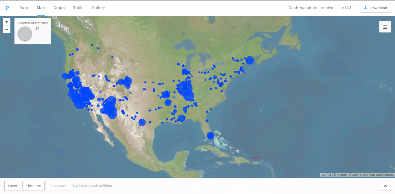
So my screenshot is super low-quality, but I played with the size point thingy on my map for the Cushman Collection photos, and made it so the points displayed the city and state of the photos when you hovered over them. And I tried to make the background and the points as colorful as possible, because I do like my pretty colors.
The title of the reading says it all – “A Map Is Not a Picture.” For example, if you were to compare a map of the old world to a map of the new world, a stark contrast that would be notice could include details of each country and how boarders change overtime. Now take that still image of the new world and compare it to software products and applications like Google Earth – or even Google Maps. Through satellite technology a user can view the entire world or galaxy and then zoom in to see streets. What we take for granted nowadays is the advancement of technology. We expect any maps to provide the rich details that Goole Maps and GPS devices provides us.
However, what the author focuses on throughout the reading is that (again) maps are not pictures. Magazine companies like Vouge and GQ, for example, photoshops their covers of celebrities while advertisers brushes up on their models to provide the “perfect image” to consumers. You can’t do that with map – but yet it’s being done.

Map Of The World 1641 Hendrik Hondius (Dutch) Newberry Library, Chicago
The reason why I say you cannot photoshop or brush-up a map is that you will distort the image, which could provide false information. However, nowadays we take the world, which is in the shape of a globe, and flatten it out on paper for the common user to use. We see world maps on posters, driving maps without any shape (other than flat), and digital maps that shapes the area you are focusing on and provide it on a flat digital surface. Sometimes the “flattening” of maps can distort the distance and terrain of an area. Referring to the picture of the old world versus the new world map, the 1641 screenshot of both worlds shows the landscapes distorted. One example would be Latin America. If you look on the left hand side, the country is shaped differently than what it actually is.
The digitization of maps is an incredibly important part of human progress in a way. Digitization of maps allow for several important things to happen globally. First and foremost it allows for people globally to look critically at maps for size, topography, and perhaps most importantly geopolitical borders. This leads to open debates globally which does not exist in the two dimensional standard of current map making. Notice the fact that print maps are two dimensional is very important. The two dimensional map standard is very important in print maps as it leaves much to be desired in terms of expressing all that a map can. Although at this point it would make a lot of sense to look at current maps and how digital maps are different than print maps. However, it is important to note that this type of comparison would result in two static images being spoken about as I could not show the working and benefit of digitization through static images as it’s benefits are that it is interactive. Instead I think it more important to show how maps can be useful in expressing ideas but can be limited when in print to accuracy. The map to the right is a map that shows slave trade from 1650 to 1860. It goes over how people were moved around the new world from Africa along with how some were brought to Europe. However, if one was to look at a map from the time period, we’ll use a ma
 p from 1600 in this case, located on the left. It is clear that the information available at that time was limited severally which would have lowered accuracy when speaking about it at that time.
Our reading this week seems to, at least in a small way, bring us back to our readings and discussions a few weeks ago about whether or not cultural heritage should be digitized or not, and the potential problems with doing so. While that discussion was mainly taking into account the importance of the items and heritage to groups of people, and how it should or should not be shared, the readings by Patricia Seed suggest that digitizing other forms content, specifically maps, can also have significant drawbacks that in some cases outweigh the benefits.
The practice of digitizing maps, according to Seed, has many important benefits for those who want to have access to them without needing the original copy or a large print reproduction. The reality of accessing maps prior digital scans and photographs of the original physical copy did not allow for easy viewing and comparisons to the original maps to be made. Now, rather than taking a large book or a cut out page to a location of an original map to compare the two, everything can be stored on a flash drive that can be plugged into any computer.
 However, Seed argues that there are potential serious drawbacks if great care is not taken to preserve the original integrity of the work. In the reading, Seed recalled when she requested to view a scanned copy of an original map at a museum, and noticed that it differed greatly from the copy that was for sale in the gift shop. She explained that the employee at the museum stated that the scanned document was edited to make it more visually appealing for sale. This editing of the map ruined the integrity of the map, as locations were now inaccurate on the edited map, and any scholarly use for the edited piece was no longer possible (Seed).
Unlike the preservation needs for cultural heritage as we previously discussed, digitizing maps presents issues that are not issues of who should be able to access the material, rather the issue is how accurate it the material. The fact that digital reproductions of maps can fall victim to Photoshop editing and the inherent limitations of the scanning process means that the viewer should never take what they see when viewing maps accurate without any doubt. How accurately a digital map is depicting the source material can be very accurate or very inaccurate, and other sources should be considered before making a determination on the accuracy of a particular piece.
Now, to turn your attention to the map posted above, it is clear that this is the type of map that you would have to use other sources to interpret to determine the accuracy of the digital copy. Without viewing the original work, you may say that this map looks accurate, the colors look vibrant and there does not appear to be any distortion on any of the ample lines on the map. However, we have no way of knowing that this reproduction of the original map is completely faithful to the source map. For example, some of the many rivers and borders on the map may have been retouched in editing post scan if there were damaged or faded on the original. If this were the case, depending on how much care was put into retouching the lines, the accuracy of the map may be compromised.
Kyle C.
Image Source:
http://www.lib.utexas.edu/maps/historical/shepherd/civil_war_shepherd.jpg
Seed, Patricia. “A Map is not a Picture: How the digitial World Threatens the Validity or Printed Maps”.
Technically, yes; a map is a visual image, but subsequently, it is not and should not be treated as a picture. Patricia Seed is very vocal in the argument of “a map is not a picture.” Print has been the “gold standard” of maps, thought to be the most trusted and reliable map, because it has to be accurate to be printed, right? Not right. The digitization of maps that makes reproduction possible has its kinks: subtle changes in axes and in color; however, Seed points out that alterations are sometimes intentional. Maps have been treated as pictures – sellers can only sell what is aesthetically pleasing, thus encouraging them to straighten lines, heighten color contrast, brighten, or darken. On the other hand, digitization has changed the map game for the better: introducing more detailed study of maps, better and easier magnification, and, of course, portability. It is just ironic that digitization is the cause of the loss of fidelity for maps. “Maps cannot be treated as illustrations” – they must maintain their intellectual integrity, or the consequences may be serious (the example used is poor planning of irrigation systems).

Take this map, for example; this print of a map is for purchase from the David Rumsey Map Collection. The note entails that the map was “hand colored;” chances are, the colors have been heightened or contrasted in this digital photo and will be in the reproduction. We would not know, though, because it does not state anything about the possibility of being photoshopped. Seed suggests that sellers clearly state “after the original” to explicitly show that it has been altered – changing intellectual property for aesthetics can be harmful.
 A map is not a picture!! This reading had me thinking more deeply about how accurate the maps that we use today really are compared to how accurate we think they are… In the reading, i like how the author compared photographed maps to magazine covers which i thought was a really good example of showing how maps do not show exactly what we think we are viewing which is kind of like an illusion in a sense because most of the stuff we see on covers of magazines for advertisment look nothing like they do in reality. Things are edited and changed to look more appealing, which could potentially be biased because the information can be different from the original and can be inaccurate. When the original maps are remade, many details may be altered and changed to be more convenient and that’s why we can’t say that a map is esentially a picture because a picture shows something as it is whereas maps arent always as exact as they may appear. The same thing can be done with maps. We dont carry actual maps we can just use our cell phones or some other type of technology. I have had many incidents where i have tried using the google maps gps naviagation on my phone or ipad and it got me lost. From the picture, It “looked” like it was the way to go but it wasn’t and it ended up rerouting me.
This picture here is just a map of our world and its basically just to show that litle things on this map could be slightly off for all we know because things are constantly changing which is another reason why we cant rely on maps 100%
This reading really got me thinking. How efficient are the maps that we use? The ones on our phones gps systems, are they at all accurate? I like how the author compares photographed maps to magazine covers. As most of us know, celebs that are on the covers of magazines look nothing like they do in real life. Things are edited and changed to look more appealing to the audience. The same thing is clearly done with maps! First of all, like the author said, the world is round but we have to turn it into a flat form in order to use it. I do think that this is more convenient for people who need to use a map. We do not want to carry around a big old map to get to our destination it is obviously easier to just have a portion of the map that is needed like on our cell phones. Only problem is that a map is not simply just a picture! A real map becomes biased when we do this because the information can be different from the original and inaccurate. When the original maps are remade many details may change. When doing this, the original map loses its original direction and meaning that it started with. This is why I have noticed many times myself and have witnessed others getting lost while using a navigation / gps. Many times it will reroute us or just have us going in circles!
The image of the map that I added has many inaccuracies. The coast lines seem exaggerated, and it seems as thought at the time they believed that you could get to Asia through the atlantic. The geography of the map is also distorted. Even minor little altercation can mess up the entire map.
According to Seed, digital technology has played a very important role in pointing out the differences between original maps and their reprints. First of all, digitizing maps has improved the portability of maps, making it easier to carry a digital image of the original map rather than the maps themselves, which were often printed in large, heavy books on thick, coated paper. Scanners also allowed the better reproduction of images in a higher quality, making maps more accurate. The increase in digitization of maps and the better access resulted in the discovery that many printed maps are inaccurate to the original, despite beliefs to the contrary.
Seed says that the printed reproduction of maps can be highly misleading to researchers. Publishers or printers often “touch up” or “improve” the original maps so that they are more aesthetically pleasing, but it alters the spatial history of a map. Imaging departments generally treat maps as pictures and attempt to correct the color or contrast, straighten crooked lines, and eliminate bumps or wrinkles before putting it in a book. According to Seed, a map is not a picture or an illustration. It is not meant for aesthetic, it is meant to convey a specific meaning. While these alterations made by reproduction companies are done with good intentions, they completely change the meaning that the original map was trying to convey. Original maps are intended to have a meaning behind the specific color it uses, the lines are indicative of the spatial relationships, and changing any of these results in a completely different meaning than what was originally intended.
Seed says that when creating or digitizing maps, curators/librarians should be brought into the process of evaluating the digital image of a map rather than being excluded, which can prevent the previously mentioned alterations from happening in the first place. Seed also states that, when a map is altered for publicity purposes, a copyright notice should be placed on the altered image to acknowledge the changes made. This can prevent any mistakes made when researchers use those reproductions as they would the original.

This historical map of Sicily (found on Google Images), when evaluated with Seed’s methods, probably isn’t accurate to the original. Both the color and contrast is very bright and stands out. The lines are all straight, and thus most likely do not convey the actual spatial relationships on the island of Sicily.
When you think of a map, what’s the first thing that comes to mind? A paper with a 2D image of the earth? To me, that shouldn’t be what you think of. If we were in an earlier age, lets say the early 1900’s, then sure, that would be considered a map, but in today’s age, the word “map” has a different meaning. Today, we have so many advancements in technology, and one of them includes the invention of 3D (three dimensional) imaged. For example, the 3D map. Let’s take Google Maps for example; their maps give you a full global view of the world. Our technological aspects have improved by far; we are now able to view the entire world from a screen, pick a state, a city, a street, and then an establishment, and literally see the main entrance to a building from our computer screen. Through google maps and google earth, we have a ridiculous amount of insight.
I truly believe that digital technologies have improved maps, due to all the points listed in the above paragraph, but also because we now have instant access to a map of anything, at anytime, and at any place. According to Seed, there are a hefty amount of drawbacks to doing so. For example, she talks about how digitizing maps can cause discrepancies from the original paper map. That may be a huge issue to the people who use maps for the historical context of them, but for the people who use maps to go places, maybe not so much.

Let’s look at the above map of the Middle East. A long time ago, Pakistan and India were ONE country. That is how previous maps showed the two; as one country. Now, Pakistan and India are two separate countries, but previous maps don’t show that.
Spatial history as it exists in the field of Digital Humanity is fascinating. Our first reading, Humanities Gone Spatial, focuses a lot on the concept of spatial history, and how it is used in a very broad context, while our second reading, Zepher Frank’s Spatial History as Scholarly Practice, pinpoints the Richard Pryor’s Peoria Project as an example of focused spatial history. This smaller scale something that I have spent a lot of time thinking about without knowing the term for it. My freshman year in college I read Patti Smith’s memoir Just Kids, and the stories that she told of how she grew as an artist and how important the context of where she was living at the time and who she was able to interact with because of where she was spatially really got me thinking about my own life. In conjunction with reading her book, I encountered people who lived completely different lives and has completely different backgrounds and experiences that made me question what a “universal experience” is. How even though we all came from such utterly different backgrounds most of the time, somehow we all still ended up at the same university, and after a brief interaction with each other, we will all go back into the work to leave our mark. Yet in this brief time, we are all influencing each other, even if indirectly. We meet each other, have classes, have lunch, interact with each other through sports or the arts, and each little change and meeting changes us if only for a moment. Using mapping to portray spatial history is a really fantastic way to look at an individuals life, as the Peoria Project did with Richard Pryor, because it lets you look at the influences that person made based upon where they were, as well as seeing how they were being influenced by where they were. Looking back at my life, I’ve spent some time mapping out my own journey, and with my location being written to every photo I take on my phone, or every time I log into Facebook, I have had plenty of geographic data to work with. This type of data, incidentally, will make projects like the Peoria Project easier, because they have the location data attached to photos and videos, so you an match where and when a person was somewhere. When I looked back at my own spacial history, I saw my past year, photos of summer and winter break popping up at my home, then pictures of my time here at university cluttering the areas where I took the photos. The precision is amazing too, because I could zoom in or out, to where photos were clustered by city, or to where I could see where on campus I had taken the photo. Some of the photos are incorrectly matched, because of some wonky GPS coordinates, but they were still correct within city and such. Looking back at my own spatial history I see where I spend the most of my time where I am also making the types of memories that I feel need to be preserved through photographs. The clusters where thousands of photos pop up are rather interesting and allow me to take a step back and have just one more thing to be aware of myself in my life.

An example of photos on my phone with location history allowing me to see where photos were taken in proximity to a building I am frequently in on campus.
Spatial history has been useful in telling stories throughout history because it lets people get an in-depth look at a specific topic from their sites. It is different in comparison to reading about history from the way online users can interact with the different topics that are on these websites. They can narrow down their findings to a specific subject that relates to any kind of research that they are planning for their projects. A disadvantage might be from how they could become bored or tired at looking at various projects that could be useful for their research.
Richard Pryor’s Peoria exemplifies the idea of spatial history from the way it lets their visitors on the website become associated with anything related to their topic. It offers insightful information about the many different themes that relate to the one broader topic that brings these ideas together. The site has images, maps, and texts that help the viewers of the website understand the content a bit more as they click on various subjects within the site.
The arguments that they are making relate to how people being involved in the sites can understand more visually than mentally. One of the readings for this week explains that spatial history is able to create arguments from they way a person can define their work that is involved in developing the projects. Sometimes people can learn more from visualizations that help them remember clearly and better than what words can do.
If I could do a spatial history, it would probably be about the many different relationships and collaborations that people in the film industry have with each other. People like directors, actors, and screenwriters have often worked together on a variety of movies throughout their film career. I somehow find it interesting in learning about the close work and connections these folks have in common. The spatial history would be an interactive map that outlines the many relationships that these people share from the film work.
If I could do my own spatial history it would be on my learning in my first college math class. I have never done so well in a math class before. It was crazy to me that I was actually learning the material. Its an all online math course which at first freaked me out a little bit but once I started doing the work then I realized I was really learning. It was a great feeling to finally understand something that I struggled with all throughout high school. Once I figured out that I could finish this class early it put a fire in me and a determination I never really had for math before. I would want to look at how I learned so much better in that setting than in all my traditional teacher in front of me teaching and explaining the math? I would want to know was it my determination or was it that I could see the teacher truly caring and trying his best to help us succeed? I would want to see sense we never had any group work and it was tailored to the individual did that change the learning environment? Or was it that we could do make up work and extra credit to make up for things because some teachers don’t even offer that. Was it the support we felt by him and each other that motivated us? It also helped that the online program itself was easy to navigate and track your progress in the class. But if I could look at any spatial history it would be on this and answering all those questions.
Spatial history is different from reading about history through passages in several ways. While a history attempts to chronologize a certain time, offering a linear glimpse of the past, spatial history offers a more comprehensive understanding of the past, overlaying various mediums to visualize and explore the relationships of objects (i.e. people, locations, etc.). In Frank’s words, the advantages of using spatial history are as follows: “1.) the possibility of creating multiple interlinked narratives; 2.) the possible integration of images, maps, commentary, and primary sources in the same field of vision; and 3). the ability to curate and shape the reader/viewer’s experience, with nudges as well as explicit direction, allowing for a hybrid experience in which exploration of the material is conducted with the aid of an unobtrusive but effective guide.” The disadvantages are as follows: “1). the danger of getting lost, of missing major aspects of the larger argument owing to the lack of a single unifying narrative line, and 2). the risk of simple cognitive overload or dissipation of energy in clicking through various strings of linked material on the site.”
Richard Pryor’s Peoria can be considered spatial history as it is not merely a history of Peoria, although the creator of the website has added the typical historical aspects. Scott Saul also augments the history with “alternative media–namely,…interactive websites filled with links to primary documents and short filmed sequences designed to provide a visually rich narrative pathway into the material for novice users.” Through the website, users of the website can interact with various aspects of Peroria and formulate their own opinions rather than just merely believe in a single written history. In that way, the illustrations also become the basis of arguments rather than mere documents that are taken at face value.

If I could do a spatial history, I would do it on the life of classical musicians. It’s interesting to note where the musicians came from and what influenced their music. Not only does location play a part in that, but their interactions with other musicians and acquaintances do, too. If I created a website, I’d add a list of composers who worked with each other and a history of their interactions with possible influences. Their personalities and life history would be something I’d research as well, allowing others to understand why a composer may have written a certain piece. As an additional resource, musical terms would help teach a person how to read a piece, giving in depth knowledge of the emotions that go into writing it.
How did space impact history? and how do digital technologies help scholars answer that question?
Today, scholars use technologies (similar to Google maps) in order to look at how geography relates to the people in a specific region. Using those digital technologies, scholars can look at how space changed overtime and how the society changed within the space. Jenna Hammerich ‘s article on GIS (Geographic Information System) technology provides a few examples of how studying spatial history answers questions like “Why did African American families settle almost exclusively on the near north side of St. Louis in the 1940s?” By looking at the northern area of St. Louis and other neighboring areas, scholars can see how the northern area could have been more convenient to African American families in the 1940’s.
I’m an English major, but I have always loved history, so I thought that this idea of using technology to answer questions relating to history. At least, at first…I started to think of the digital humanities really had a place in answering these questions. Couldn’t scholars answer these kinds of questions without digital technology? Well, Professor Colin Gordon, quoted in Hammerich’s article, answered my question, by saying that answering such questions and making discoveries would be possible without GIS technology, but “It would have taken longer.”
I think that is a reoccurring “theme” within the digital humanities. Scholars can answer questions about history and the humanities without digital technology. But the technology is time and cost effective (and probably fun to use).
This weeks readings were about the concept “Spacial History.” Most of you guys have probably used google maps to search a location and maybe have even used the neat street-view tool to explore the surroundings. Google maps is essentially a less developed form of “Spacial History” that Jenna Hammerich and Zephyr Frank are explaining in the readings. With “Spacial History” technology, one would be able to look at a map and not only see just locations, but an immense amount of data that you would never even think of. Jenna Hammerich gives an example that a “Spacial History” map could answer the question, “Would Robert E. Lee have been able to see Union forces on the far side of the battlefield when he ordered the notorious Pickett’s Charge?”
This is a link to the Stanford History Project website where a group of collaborators contribute their own projects of GIS for the world to see and other researchers to learn from. This link in particular will take you to a map titled “Salmon Flu Transmission in Salmon Aquaculture”. This map is an easy-to-understand example of Spacial History. It shows not only a map, but many different graphs and statistics of the flu transmission between Chile and Norway.
http://web.stanford.edu/group/spatialhistory/cgi-bin/site/viz.php?id=427&project_id=1019
This image below has pinpoints of where a certain community theater performed a particular play in Baltimore in 1980.

(http://publichistorycommons.org/google-map-engine-lite/)
Overall, I believe Spacial History will is a powerful tool and we become an even more powerful tool in the future. There are so many endless possibilities and I am excited to see what people will continue to do with it. One thing that Jenna Hammerich touched on was that researchers can now create maps for past historical events and study them even more closely possibly coming up with new findings that we have never even thought of!
This past week in class, we dedicated our time making exhibits and learning about the ways of Omeka. For me, this was a completely new experience and I had never heard of Omeka before let alone know such exhibits existed online. This is one of my favorite activities that we have done in class and I learned a lot from it mostly because it was very hands on.
First, I learned that a lot goes into attributing a source. Dr. S gave us resources such as wikimedia.org where we could find images on our own and use it to build exhibits on Omeka. While in the past I would have thought that it’s as easy and copy and pasting, the Omeka site taught me that there are endless possibilities to attribute the source and even explain what the picture represents. For example, I used a photo that was a statue of two gladiators. While I definitely needed to attribute who sculpted the statue, where it was from, and what year it was made in, the interesting thing I learned was that the source I was using was actually just a PICTURE of the sculptures and not the physical sculptures themselves. Therefore, I then had to attribute the photographer who took the picture, when it was taken, and where the original picture came from. It was interesting to see how many layers of copyright there actually are.
Next, I really enjoyed creating an exhibit with my group on a subtopic. Like I said, this site was completely new to me and I didn’t even know that it was possible to do this. I thought it was really cool how each of member of my group created their own page yet all of our pages came together in one exhibit. It was easy to navigate through and a great way to store a lot of knowledge. It was also really interesting to hear all of the other groups present their exhibits and see what their thought process was.
Overall, I thought the Omeka website was a very interesting learning tool and it is something that I would have never thought of. Omeka can be very useful if you are researching something and want to keep track of your attributes and citings as well as also present your information to the world.
-Jillian
To sum up what I gleaned from our latest readings, spatial history in and of itself is a pretty nifty concept. What spatial history essentially boils down to is presenting history through a means of visualization, of tangible spaces that can be traced through passing time. Instead of simply learning about historical events through a written resource, spatial history allows for an in-depth exploration of significant spaces.
A lot of this historical exploring comes through digital maps. The article by Jenna Hammerich talks about a few different spatial history projects, one by Colin Gordon that uses a layered digital map to track the development of St. Louis throughout the 20th century, and another called “The Dutch in the World”, in which Julie Hochstrasser is working on creating a visual catalog of 17th century Dutch trade sites. Hammerich talks about both these projects through terms of GIS, or geographical information systems. In using these systems to construct spatial visualizations, both Gordon and Hochstrasser are providing a means of delving deeper into the histories they are researching. Without digital maps and other visuals, the scale of St. Louis’ growth or the trade influence of the 17th century Dutch would just be a few statistics or remarks on paper. Having something visual to explore history through, particularly if it’s an interactive visual, gives historians a greater understanding of and connection to whatever they’re studying.
Both readings touched on one of the biggest differences between conventional history study and spatial history: collaboration. The chapter by Zephyr Frank talks a lot about this from the introduction on. He constructs spatial history research in the context of a lab, full of scholars from different backgrounds who have to work together to create something visual and instructional. Looking at history through a spatial context brings all kinds of people into the same realm of study, both in the case of select groups of historians, and communities interested in the things a historical visualization might display. Frank states that spatial history is essentially based on movement, meaning that space and time can be looked at through a lens of history’s progression through geographical space. This is also where the collaborative aspect of spatial history comes in, as many people are needed in order to construct something with digital technologies that requires varied areas of expertise.
Another aspect of spatial history that I found interesting was the lack of hierarchical thinking that goes into it. Generally speaking, traditional historical studies tend to follow a timeline of events, going from oldest to most recent. Spatial history allows researchers to break away from that rigid mold, and instead provides a web of connections that can be made between historical events, spaces, etc. Frank cited Scott Saul’s website called Richard Pryor’s Peoria as an example of “horizontal thinking”, aka looking at all kinds of historical aspects in tandem with one another. I took a peek at Saul’s website myself, and the whole thing is stuffed with visuals, including digital maps of places that were significant to Richard Pryor. This sheds light on Pryor’s life from several different directions, rather than the one that would come from, say, a biography of him. In using spatial history like this, Saul gives us a richer idea of Pryor’s life, and all the various influences that made up the whole. History is divided into many different slices, and spatial history allows us to look at all of the slices in relation to one another, rather than just on their own, or looking at them as one solid whole.

A map of North Washington Street, taken from Scott Saul’s website, Richard Pryor’s Peoria.
© 2024 Introduction to Digital Humanities
Theme by Anders Noren — Up ↑


